Japonism is a term used to describe the influence of Japanese art on European artists. Japonisme was coined in France by Jules Claretie. From Wikipedia: “Japanese wood-block prints became a source of inspiration for many European impressionist painters in France and elsewhere, and eventually for Art Nouveau and Cubism. Artists were especially affected by the lack of perspective and shadow, the flat areas of strong color, and the compositional freedom gained by placing the subject off-center, mostly with a low diagonal axis to the background. “
I fell in love with Japanese painting and Japanese woodblock printing, last spring when I took my Color Design class. The instructor was teaching us how to create color palettes for either digital or regular painting and he had us download several of these images for the assignment.
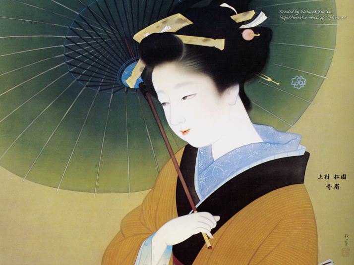
Japanese woodblock (sometimes called woodcut) prints lend themselves perfectly to this training because of their limited, simplistic, yet pleasing palettes. The images I chose to use to create my palettes are shown below. As with most of these prints, artists are unknown.
First we import the image into Photoshop and with the Eyedropper tool we pick out the various colors and fill the rectangles in the color bar with them. At first glance there seems to be just a handful of colors, but with the Eyedropper tool you soon discover that what at first looks to be orange is actually three shades of orange. This fun exercise also required the estimation of the percentage of the whole painting that each color was used. The vertical bar to the right of each painting shows the resulting color palette and the approximate amount of each color.
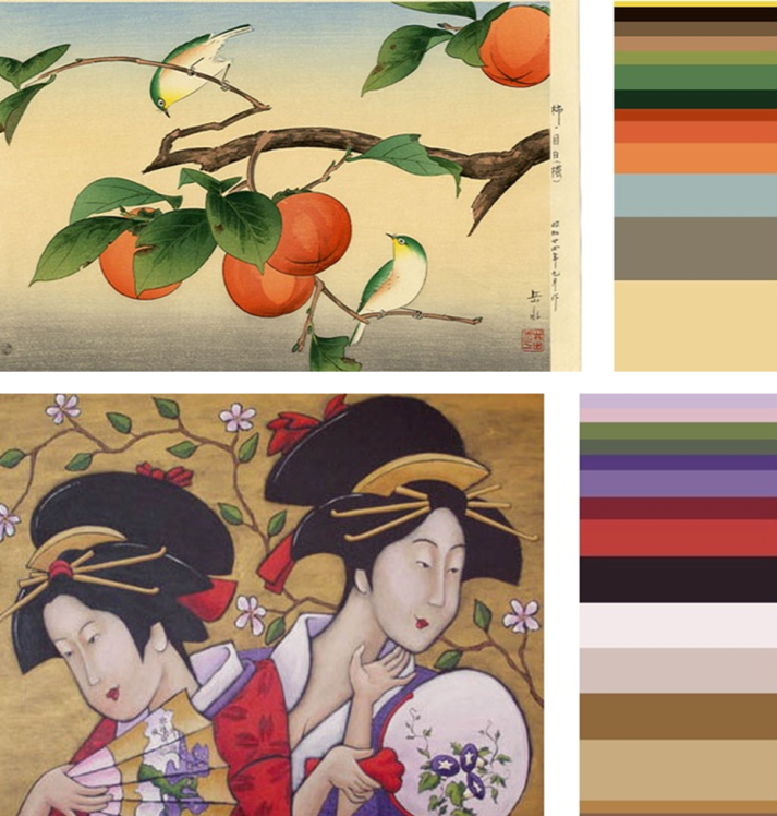
Color Palette Exercise for Color Design Class by Laura J. Larson
After you finish this exercise, you can save your palette for a future digital painting, or you can print it in order to mix your own palette from paints, or your choice of medium, from pastels to colored pencil. This method allows one to create art that has pleasing hues and color combinations. It’s also very efficient because you can make all your color decisions up front, prepare your colors in advance, and have a general idea of the overall color tone of your piece.
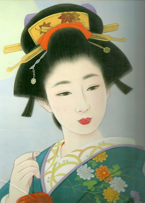
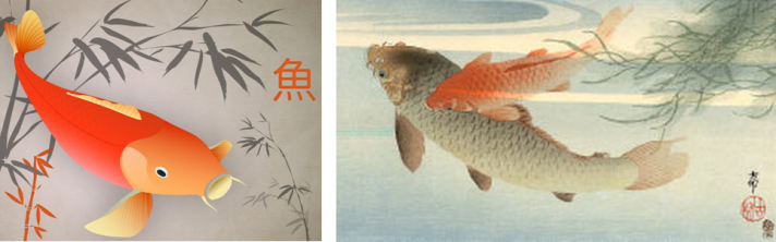
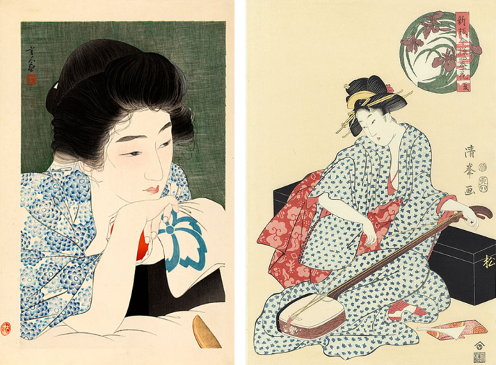
I promised myself at the time to collect more of these Japanese woodblock prints for future use. I found several themes in this style of art: nature, floral, fruit, fish and birds, waves, etc. but my favorites are the Geishas. Many of these prints were never signed, so accreditation is rarely possible. For the purposes of this blog, I want to share them with you without details.
History of Woodblock Printing
During the Edo period in Japan (1603-1867) Japan began to adopt the Chinese method of woodblock printing to print books. The earliest known examples of woodblock printing from Japan were small wooden pagodas, each with a woodblock scroll in Buddhist text. One million of these were commissioned by the Empress Koken to give to temples around the country as symbols of thanksgiving that the Emi Rebellion was over.
Woodblock printing was a method that allowed for the first attempts at mass production. It was used for the printing of many literary materials to include the Japanese classics, travel guides, advice manuals, novels, art books, and plays.
Technique
The text or image was first drawn on paper, glued to a block of wood (usually cherry), and then the wood was cut away based on the design. Ink was applied to the block and pressed onto paper. This was first done all by hand; later complex mechanisms were invented to hold the wood block still, apply consistent pressure, and allowed for precision alignment when multiple layers of color were later introduced.
There were many types of Japanese woodblock printing as technology developed:
Sumizuri-e: Monochrome printing using only black ink
Benizuri-e: Red or green details or highlights were added to the monochrome
Aizuri-e: A single color, mostly indigo or purple, was used instead of black ink
Urushi-e: Ink was thickened with glue for relief, and sometimes gold or mica
Nishiki-e: A method of using multiple blocks for different portions of the image, using several colors to achieve complex and detailed designs; registration marks called “kento” were used to align each application of blocks.
Research:
http://en.wikipedia.org/wiki/Japonism
http://en.wikipedia.org/wiki/Woodblock_printing_in_Japan
http://www.ehow.com/about_5246819_japanese-woodblock-prints-history.html
http://www.stolaf.edu/people/kucera/YoshidaWebsite/evolution/essay_pages/jason_bossen.htm
http://www.ukiyoe-reproductions.com/html/history.html
http://www.artelino.com/articles/japanese-woodblock-prints.asp